Building a website like it's 1999... in 2022
Edit May 2023: the Bridgy integration with Twitter no longer works due to Twitter shutting off API access so some functionality won't be working any more!
Note: This is a written version of a talk I gave at State of the Browser 2022 in October 2022!
Motion warning: This page contains quite a few animations, but if you have reduced motion turned on, they won't play.
The web used to be weirder
I'm on a bit of a mission this year to bring back the spirit of the old web. The creativity and flair of the late 90s and early 2000s. Back then, there were no rules – you put whatever you wanted on a webpage, because it was your space to do as you please.
And for a whole generation of internet users, having a website was the cool thing to do. It's just what you did back then. We're talking pre-social media, pre-web 2.0 – the good old fashioned static personal home page.
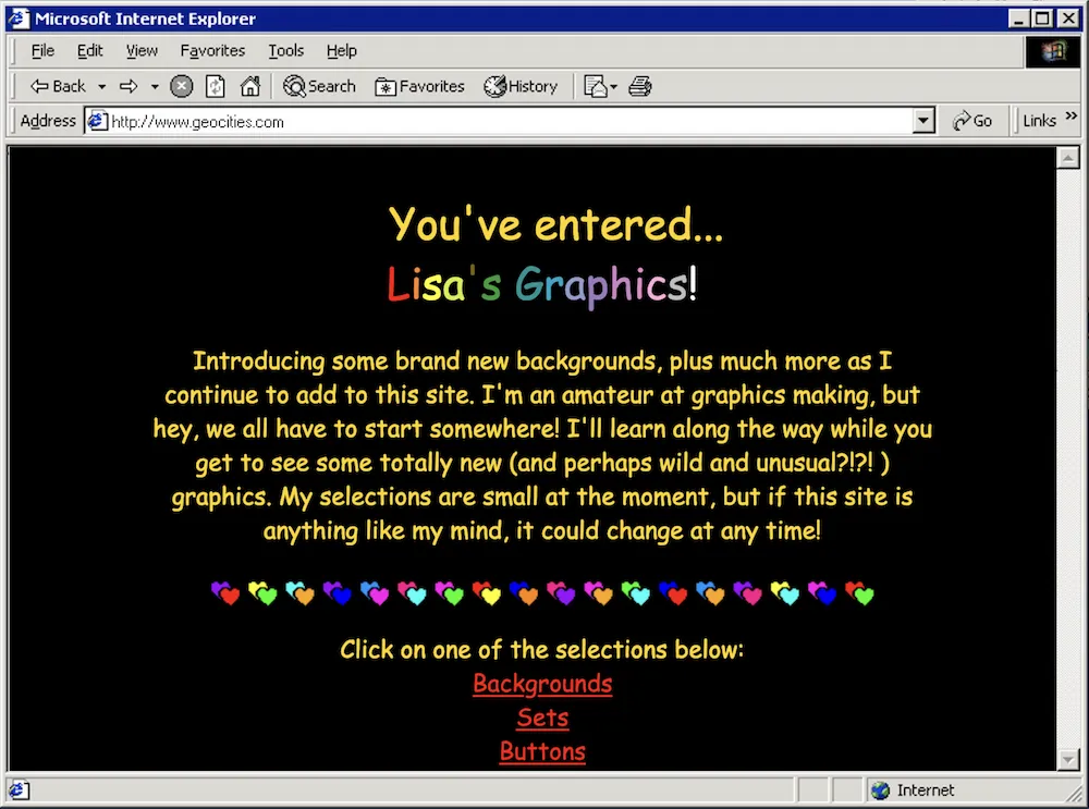
Sites like Geocities, Angelfire, Tripod and Expage offered free static hosting for all, and the number of personal websites boomed. Some hosts offered drag-and-drop website builders so you didn't even have to learn HTML.
We might look back on these websites now and laugh – they look ridiculous compared to the sleek and minimalist sites we're used to nowadays. But I actually think we've gone too far in the other direction, and now so many websites look the same. These old personal websites were a reflection of yourself.
Some of these websites were for family to share photos and updates...

...while others were full of graphics to share and use on your own site...
...and some were fansites. Look at those frames! I got this screenshot mid-<marquee>-scroll as well.

I played a game a couple of years ago called Hypnospace Outlaw, which is a completely bonkers game where you're a moderator of a version of the 90s web that you access in your sleep. The homepages in this game were directly inspired by Geocities websites (there's a really good episode of Noclip about it) and it made me so nostalgic. I really recommend it if you haven't played it already! It really captures the spirit of the time – the personality and weirdness that made these sites so special.

Let's bring back the weird
I'd love to see this spirit return today – the experimental and fun side of the web. My goal is to show you how we can be just as creative today but using modern and accessible methods. Because, as fun as they were, old websites were a nightmare for accessibility. We didn't really use semantic HTML, we used tables for layouts (instead of, y'know, tabular data), everything was constantly flashing and moving. Luckily for us, the modern web allows us to be just as creative while still considering the user at the other end of the browser.
So naturally, I built a 90s-style website, with some of my favourite old web tropes. I used as much modern HTML, CSS and JS as I could. Let's take a look through some of the features and how we might recreate them!

Animated GIFs
GeoCities sites were absolutely littered with GIFs. Flames, construction workers, dividers, even animated bullet points. Animations were a lot of fun, and almost an art form to squeeze so much into such a tiny filesize.

This is a screenshot from cameronsworld.net, which is a beautiful archive of GeoCities GIFs, and an artwork in itself.
Nowadays it's easier than ever to put animations on our sites, whether that's still the humble GIF (internet is so much faster these days), more modern formats like webm and gifv, or even SVG animation with CSS or libraries like GreenSock. But we can do better still.
The standard code to include an image hasn't changed much since the olden days:
<IMG SRC="flames.gif">
In those days, of course, we wrote all our HTML in capitals because that was what you did for some reason. XHTML, maybe? Anyway, the consequence of this is that everyone sees the GIF whether they like it or not. For people with epilepsy, vestibular disorders, or anything where motion causes sickness, autoplaying GIFs are a big problem. Luckily, wcan fix this today, with something we didn't have back then!
The prefers-reduced-motion media query
Using this media query, we can only play the GIF if the user doesn't have reduced motion turned on on their computer – so everyone can enjoy our trash website, regardless of their access needs.
Harnessing media queries with the picture element
The HTML5 picture element allows us to specify an image, and then potential alternative sources for it.
	<picture>
    <source srcset="underconstruction.gif"
    media="(prefers-reduced-motion: no-preference)">
     <img src="underconstruction.png"
    alt="Under construction" />
  </picture>
In the above code snippet, we've got the img tag as before, but this time it's showing a still version of the GIF, which I made by opening the GIF in Preview, pulling out the first frame and saving it as a PNG. The source tag contains the URL of the GIF, and will only kick in if its media attribute is satisfied. So if you don't have reduced motion enabled, the source of the image will be replaced by the animated GIF version. Magic!

Text effects
Remember <marquee>? It made text scroll across the screen, like ticker tape.
Wheee!
Or those of you with Netscape would have had the infamous <blink> tag, which makes text blink in and out of view...
This is awful
Ultimately, text effects like this don't belong in body text. Even if you don't have any access needs to speak of, it makes reading text really hard. There's a good reason they were both deprecated.
Instead, I thought, why not have fun with headers? In days of yore we'd make cool text-based headers in whatever graphics programs we could get our hands on – or even just MS Word. Text with flames, rainbow fonts, you name it.
These days we can recreate this magic using CSS instead of using an image! And the great news is, because it's normal text with CSS doing the heavy lifting, it's still totally accessible.
For my next trick, I'm drawing inspiration from an OG 90s classic: Microsoft WordArt.

WordArt, but make it CSS
While not strictly from the 90s web, WordArt for me harks back to the aesthetic of 90s maximalism, and definitely fits aesthetically with what I'm trying to do.
I'm going to show you how to recreate two of my classic favourite WordArt styles using modern CSS.

Gradient-fill text with background-clip
You can't colour text with a gradient (yet) in CSS, but you can give an element a gradient fill background. Using the background-clip property we can control where the background shows. Specifically, we can set background-clip: text to make the background only show wherever there's text in the element.
Then, if we make the actual text transparent, only the gradient background will show through.
background: linear-gradient(183deg, #6000CA 10%, #CA00CD 70%);
background-clip: text;
-webkit-background-clip: text;
color: transparent;
font-family: 'Impact';
WordArt
Pretty!
Then let's add a transform property to make it look a bit more like the real deal.
transform: skewY(-8deg) scaleY(1.3) scaleX(0.8);WordArt
Adding the drop shadow
Now we need to add the light purple drop shadow. But if we try to use the text-shadow property, it shows up on top of the text!
WordArt
This is because we're really looking at the background – the actual text is transparent and sitting on top. If I change the colour of the text to the body colour, you'll see what I mean:
WordArt
To get around this, we'll need a wrapper element that contains the shadow, so it appears behind the text-shaped gradient background.
<span class="purple-wordart-wrapper">
	<span class="purple-wordart">WordArt</span>
</span>
We'll add a drop-shadow filter to the wrapper element. This adds a drop-shadow the same shape as the element's children, and because the background is clipped to the text in the child span, the drop-shadow will follow that shape too!
.wordart-wrapper {
	filter: drop-shadow(2px 2px 0px rgba(130, 140, 251, 0.8));
}
The result:
WordArtUncanny!
For my second WordArt recreation, I'm bringing back my old childhood favourite – the rainbow one. I remember using this one all over my primary school homework.

We've got another gradient fill here, so we'll use background-clip: text again to get the same effect, and chuck on a transform to get the right shape.
background: linear-gradient(
  90deg,
  #9c00ff,
  #ff0000,
  #ff8800,
  #ffff00,
  #02be02,
  #0000ff,
  #4f00ff,
  #9c00ff
);
background-clip: text;
-webkit-background-clip: text;
color: transparent;
font-family: 'Arial Black', sans-serif;
font-weight: bold;
transform: scaleY(1.5) scaleX(0.6);
transform-origin: left;
WordArt
We'll use a wrapper element to create the shadow again, but this time it's a little different. This has more of a 3D effect, where the shadow kind of flattens and goes to the left, as if we're looking at the WordArt from the front.
CSS can do that!
Getting some perspective
.wrapper {
  font-family: 'Arial Black', sans-serif;
  font-weight: bold;
  display: inline-block;
  position: relative;
  perspective: 150px;
  perspective-origin: bottom center;
}
We can use the perspective property to put us into a kind of "3D mode". It tells the browser, "act as though I'm standing this far away from the element". In our case, 150px.
We then set the perspective-origin property to determine what position we're looking at the element from. I want it to seem like we're in front of it, at the bottom.
What this will do is change the way that transformations apply to the element, taking into account the perspective to manipulate it along the Z-axis as well as X and Y.
To create a shadow effect I'll target the wrapper::before pseudoelement, and set its content to "WordArt" to mirror the text. This will make the "shadow" text appear behind the rainbow gradient. Then I'll apply some transformations to skew the "shadow" – that perspective property on the wrapper element will change the way it rotates and skews.
(This one needs a bit more hacky wrangling when you change the font size, and I use fluid typescales so I'm going to embed a Codepen a bit further down instead of rendering it inline!)
.wrapper::before {
  position: absolute;
  content: 'WordArt';
  color: #000;
  opacity: 0.2;
  bottom: -2rem;
  left:35%;
  transform: rotateX(60deg) skewX(65deg)
  scaleY(2.8) scaleX(0.9);
  transform-origin: bottom right;
}
Right now, the CSS is hardcoded to have a shadow that says "WordArt". If we want to use this text style for other things too, how can we dynamically set the shadow text content? With the CSS attr() function!
attr() gets the content of a given attribute for an element. I've called mine data-content. So, in our wrapper::before rule, content: 'WordArt' becomes content: attr(data-content):
.wrapper::before {
  position: absolute;
  content: attr(data-content);
  color: #000;
  opacity: 0.2;
  bottom: -1rem;
  transform: rotateX(60deg) skewX(60deg)
  scaleY(2.8) scaleX(0.8);
  transform-origin: bottom right;
}
And render the HTML with the attribute:
<span class="rainbow-wrapper" data-content="Rainbow">
  <span class="rainbow">Rainbow</span>
</span>
Now we can write different words!
See the Pen Rainbow text by @sophiekoonin on CodePen.
It's not perfect, but I think that looks good enough for a throwback site header!
Music
In 2001, I had a NeoPets shop. As soon as you loaded the page, you'd be greeted with the dulcet tones of Teenage Dirtbag, in MIDI form.
<EMBED SRC="mysong.mid" HIDDEN="true"
    loop="yes" volume="10" autostart="true">
Autoplay, naturally, and looping. Definitely hidden, so the music was just there. But it was super distracting, quite disorientating, and you couldn't turn it off.
Modern browsers block autoplaying audio, for good reason. It's extremely annoying. Thankfully, the HTML5 audio element gives us a bit more control.
  <audio aria-label="Play music" controls
  src="/soundtrack.webm"></audio>
You can still have audio on your website! Just make it opt-in. If it's part of the experience you want to create, that's totally fine, as long as your viewer is okay with it playing.
Make sure to add a label – whether external or aria-label – to tell the user what it does.
The controls that show up are the browser default – what's rendered above will look different depending on whether you're in Chrome, Firefox, etc. But you can use the Web Audio API to customise the controls, by rendering some pretty buttons and using JavaScript to make them control playing audio.
Cursor trails
Then: Dynamic HTML
Back in the day, a cursor trail was a real flex. It said, "look at what I can do with JavaScript!". (Or in my case, what dynamicdrive.com could do with JavaScript.)
This was known as Dynamic HTML: not necessarily a technology in its own right, but a collection of technologies (a bit like we use the term JAMstack now). HTML, CSS and JavaScript – but a very old version of JavaScript. Everything was client-side at this time, because we didn't have AJAX/client HTTP requests yet. And the implementations differed significantly between the two major browsers of the time, Internet Explorer and Netscape. (This is a period known as the 'Browser Wars', and there's a good summary of it on The History Of The Web.)
It led to stuff like this, from a Dancing Stars animated cursor trail. This cursor adds a trail of seven 3px-wide yellow "stars" (tiny squares) that appear to follow your cursor around. I can't show you a preview, because the script doesn't work any more.
First we had to check whether the script was running in IE, or Netscape, because the implementation would be completely different. In IE, we'd check for the existence of document.all, a function which returned all the elements in the DOM.
If this was present, we'd then call document.write (a function we also shouldn't use any more) to insert several little 3px <div> squares into the DOM.
if (document.all) {
  document.write('<div id="starsDiv"
  style="position:absolute;top:0px;left:0px">')
  for (xy = 0; xy < 7; xy++)
    document.write('<div style="position:relative;
    width:3px;height:3px;background:#FFFF00;
    font-size:2px;visibility:visible"></div>')
    document.write('</div>')
}
Netscape didn't have divs, it had LAYERs. This is basically the same thing with a different name, because browser creators at the time liked causing pain.
(Side note, this is why some people used to refer to divs as "div layers" – it encompasses both elements.)
<LAYER NAME="a0"
  LEFT=10 TOP=10
  VISIBILITY=SHOW
  BGCOLOR="#FFFF00"
  CLIP="0,0,3,3">
</LAYER>
}
If document.layers returned something, we knew we were in Netscape, and could do Netscape things. In this case:
if (document.layers) {
  window.captureEvents(Event.MOUSEMOVE);
}
The full script is available at DynamicDrive.com.
Now: Canvas and requestAnimationFrame
Tim Holman has done the hard work for us here, and recreated 90s-style cursor effects with modern JavaScript and HTML.
Tim's cursors use canvas, which is much more performant than rendering individual elements into the DOM. You also get much more fine-grained control over how elements are positioned. Can you imagine trying to render this many stars into the DOM in the old script? Using the canvas API and requestAnimationFrame – the function that allows us to batch up animations and efficiently update them before the browser's next repaint – we can render lots of little stars, making them fade in and out in lovely ways.
Media queries work in JavaScript, too!
Of course, cursor trails mean animations, and not everyone wants to see those. The good news is, we can use media queries in JS, just like we do in CSS and HTML <source> tags.
const prefersReducedMotionQuery =
	window.matchMedia('prefers-reduced-motion')

if (!prefersReducedMotionQuery.matches) {
	cursor.init()
}
By calling window.matchMedia with the name of the query we're interested in (prefers-reduced-motion), we can check the value of the user's motion settings and only init the cursor if they don't have reduced motion enabled.
You can even add an event listener to the media query, so that when its value changes we can dynamically initialise or destroy the cursor accordingly.
prefersReducedMotionQuery.addEventListener('change', () => {
	if (prefersReducedMotionQuery.matches) {
		cursor.destroy()
	} else {
		cursor.init()
	}
})
Webrings
In the days before search engines were particularly good, how did you find similar websites? Webrings, of course. A webring is a collection of websites based around a shared interest or topic. Webrings offered a sense of belonging to a community, and gave you a fancy plaque to put on your website.

Each site in the webring would have a plaque like this so you could navigate the ring, and there'd be a backend somewhere (probably written in Perl) that did all the hard work of calculating which site came where in the ring.
I built my own webring for State of the Browser 2022 attendees, with a Google Sheets backend (for time-saving/live demo reasons) and a Cloudflare Worker on top of that to work out which site to send people to. It checks the value of request.referrer to see where the call is coming from, looks up that URL in the list of sites, and returns the next or previous one accordingly.
async function handleRequest(request) {
  const { pathname } = new URL(request.url)
  const data = await fetchAndParseCsv()
  const referrer = request.referrer
[...]
For something a little more permanent/professional, I recommend checking out Max Böck's webring kit.
Guestbooks
Last but not least, the humble guestbook! In the days before social media, this was how we showed our appreciation for webmasters. Rather than just building a guestbook I thought I'd do something a little different for the talk. It's a guestbook all right, but it's powered by Twitter!

Instead, I used a technology called webmentions: a protocol to notify a website when someone else links to them, such as on their own website or on Twitter. Webmentions are collected as a feed (a bit like RSS) and associated with a domain name or host. I put meta tags in the head of my site to indicate that I'm on the lookout for webmentions.
I use webmention.io to collect those webmentions for me, though it's totally possible to set up your own server to do so. On this website (localghost) I collect webmentions at build time and publish them underneath the pages, but on the demo website for this talk I have a client-side script to fetch mentions as I wanted to be able to demo them live.
I use brid.gy to collect mentions from Twitter and send them to webmention.io, and then my site queries webmention.io to get the feed of mentions.
Go forth and build weird stuff!
The web is an amazing platform brimming with opportunities to be creative and experimental. I'd love to see what you build – if you mention this page on your own site or Twitter, the webmentions will appear below, or tag me @type__error!