Just because you can doesn't mean you should: the <meter> element
I came across Sara Joy's (very cool) demo of CSS theming without classes today, and looking through the code spotted a couple of elements I hadn't come across before: <progress> and <meter>. Granted, I've probably seen the <progress> element plenty of times, but I struggled to see what the <meter> was for.
While <progress> is fairly self-explanatory – it shows how far along something is, such as your progress through a form – the <meter> element was less obvious to me, so I had a look at the MDN page to see what they suggested.
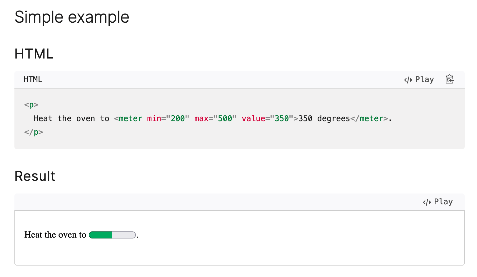
This is a prime example of following the letter, not the spirit, of semantic HTML. Yes, technically the cooking temperature is somewhere between the lowest and highest temperature you can set the oven to, but is this actually helping people understand the recipe? Quite the opposite, it's making the recipe less accessible for anyone not using a screen reader.
Now, chances are the person who wrote this article simply couldn't think of a better example, and isn't necessarily proposing that everyone starts using meters instead of numbers in their recipes, but a lot of developers rely on MDN to tell them what is good practice, so I don't think this is particularly useful. (I'm going to try and contribute a better example.)
Inspired by this, and with a burning desire to build something truly terrible, I've created this recipe page using the <meter> element for every numerical value.
See the Pen
CodePen Home
A recipe, but all the numbers are
The spec has a few more sensible examples, though I'm not entirely persuaded that a meter is a good illustration of newsgroup activity.
A more tangible use case for the <meter> element would be to indicate something like available storage space, or percentage of remaining budget on a service where your plan only allows you a certain number of events or entities: an example of this would be Sentry, where your plan has a limit to the number of events/errors it'll accept, depending on how much money you throw at them.
The key UX thing here, though, is that if it's important information it should be accompanied by a numerical value. A meter is good for an at-a-glance sense of how much of something has been used, but you need to present it alongside the actual value for it to be at all useful.
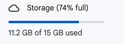
I checked both Dropbox and Google Drive, and both of them have a meter accompanied by a numerical description of how much space I've used; in both cases those meters are, of course, <div>s. Usually I'd complain about using a <div> when there's a semantic element available, but... it's not immediately clear to me what the advantage of using a <meter> would be from an accessibility viewpoint, if you've got the written description right there.
When you're choosing the right element for the job, it's entirely possible to go too far the other way, and overuse semantic elements when actually they hinder more than they help.
As my good pal and accessibility specialist Helen put it:
It’s a really good example of thinking about what you’re trying to communicate and to who and whether your “semantic” choices actually enable that.