Remembering the early 00s teen website scene
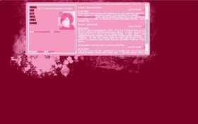
localghost.dev has a new theme! In search of a little project over the merrineum that didn’t require me to learn anything and therefore use my brain, I remembered there was a stylesheet hidden in the themes directory of my website that I hadn’t finished. The theme: teenage personal websites in the early 00s. It was a lot of fun to build, and really nostalgic to recreate the websites of my youth. Think impossibly tiny fonts, blocky layouts with a sidebar full of assorted crap, and grungey photoshop brushes. (But this time with CONTAINER QUERIES.)

Try out the new theme by clicking the scribbly heart in the middle of the theme switcher.
I touched on this era of my online past in my talk “This talk is under construction: a love letter to the personal website” from FFConf 2022. Rachel White also wrote an excellent post about this topic back in 2016 called Keep The Internet Weird, and even gave a talk about it at JSConf EU 2017. This quote from her article particularly rings true for me:
I can still remember spending hours on the Internet scouring free resources created by other teenagers for really great grunge brushes to create the best layouts that represented me at that point in my life.

I've recreated some of this magic in the new theme, complete with the stupidly tiny content box that scrolls, and the font that you have to squint to read.
All of this has me reminisicing about my adventures building websites as part of this early 00s scene, so I thought I'd share some of those memories.
TLD is everything
If you were going to have a domain name, you had to have the right TLD. For some reason .org and .nu domain names were really fashionable. I remember sites with names like partly-cloudy.org and lipsofpink.org.
Of course I never had a domain because my parents wouldn’t pay for it (very reasonably), so I had to do the next best thing: be hosted on someone else's website who was cool enough to have a domain.
Since the webmasters of the early 00s let these domain names lapse a long time ago, there’s very little evidence of this scene on the internet. Google searches for “2000s teenage blog scene” come up with a lot of “Y2K” inspired tumblrs and reminiscences of the actual scene subculture, something entirely different. There’s the occasional Reddit post where someone asks “hey, does anyone remember...” and there will be one person who does, and everyone else just remembers LiveJournal (everyone remembers LJ).
Thank goodness for the Internet Archive and its Wayback Machine, which has snapshots of many of these sites. Sadly a lot of the images aren't there, so you can't experience the full, over-the-top glory of the layouts. Hopefully the new theme on this site will give you a taste of what it was like.
I had three different hosts over a few years, and slices of those sites are still findable on the Wayback Machine, so you can be assured I won't be telling you what those domains were in the interests of self-preservation (translation: it's too embarrassing).
It's been a stark reminder of the importance of digital archiving, finding all of these sites incomplete in some way: content missing, stylesheet missing, images missing. With every site, there’s probably going to be a point where you don’t want to renew the domain name any more, or the host itself disappears. It’s really important that you have some kind of backup of the content, not only in text format but visually as well: the Wayback Machine has only captured snippets of my old sites, and often the images and stylesheets don’t work. I’d give anything to see full screenshots of what some of those sites looked like.
This is my space, but here's something for you
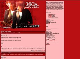
Blog posts – annotated with the music you were listening to while writing, of course – would be little windows into your everyday life. I remember reading some older teenagers' blogs, especially those in the States, and thinking how extremely cool they seemed. Driving! Relationships! Life that didn't revolve around exams!
The homepage would always be the blog (splash screens were passé by this point), but there would always be a page about the site's owner, then a page of things for the visitor such as downloadable graphics, Photoshop brushes or HTML snippets to use on your own site.
Something that was particularly great about this scene was that there was a real sense of community, both literally with the networks you formed with other bloggers, but also through helping other people be a part of it by teaching them HTML skills. We'd all make friends and comment on each other's blogs and link to our friends' and fellow hostees' sites, most of whom were people that we'd never even met.
Most importantly, though: a lot of these websites were run by teenage girls and young women. It was a space on the internet for marginalised people where we could be ourselves, whether under a real name or an alias. Our families wouldn't find it, and IRL friends wouldn't either unless you gave them the URL of your site, so the like-minded audience that you had was very small and controlled as well. It felt like a really safe space to be yourself. None of the carefully curated content feeds that you get on social media these days (or even blogs these days, a lot of the time).
At the time, I was pretty unpopular at school, in part because I was such a computer geek (it was very much Not A Cool Hobby) and I used to spend breaks at school working on my website in the IT room. The group of friends I fell into – who I'm still very close with today – were all like-minded geeky types with our own websites. Seeing and interacting with these older teenagers online with these fancy domains and cool layouts made me feel like I was part of something and that my interests were actually socially acceptable.
Of course, joke's on all the people who thought I was uncool, because now I'm so cool that I have a domain name that I need to explain to everyone who isn't a developer every time I give someone my email address.
Version 17
I’d happily fire up FileZilla and FTP into my server, set up Greymatter or later Wordpress, and spend hours after school building layouts for my website, and my friends’ websites. Later I learned some very basic PHP so that I could include layout headers and footers on separate pages of my website, and even make the footer copyright date dynamic instead of just hard-coded.
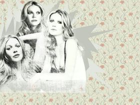
We’d change the layouts on our sites very frequently – once a month or even more often – and keep track of which version we were on in our site sidebar. Layouts were usually a main bit and a sidebar, first with tables and later with absolutely positioned divs; every layout featured a large header image composed of a transparent cutout PSD of some band or celebrity with the obligatory grunge photoshop brushes on top. I have a handful of my later header images saved, but most are lost to time.
There were websites offering cutouts of celebrities from magazine scans and photoshoots; I’d make header images in my cracked version of Paint Shop Pro with whatever PSDs I could get my hands on, regardless of how much I actually liked that celebrity. That’s how I ended up with layouts featuring such gems as, er, Paris Hilton or Gwyneth Paltrow.

Over time, tiny scrunched-up scrolling box layouts were replaced by full-page ones, still clamped to the left hand side of the browser, but with even more room in the sidebar for fun things.

Website tsatskes
Another thing I miss from early websites is the random tsatskes you'd accumulate from around the web and display proudly on your homepage, and these websites were no exception. You might have fanlistings for things you love, links to cliques you’d joined, or 88 x 31px buttons linking to other websites.
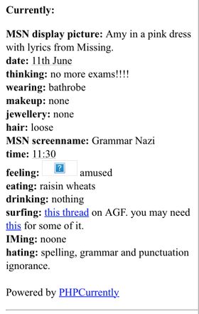
Those of us on PHP-enabled servers might have some codegrrl scripts like PHPCurrently, a customisable list of what you were doing at any given point in time. I mentioned this in my post about APIs for things and I can only apologise for this absolutely awful example of what I was like as an Evanescence-obsessed teenager in 2004:

Or maybe PHPCalendar with mundane events from your life:

The end of an era
I think it was ultimately LiveJournal that killed off this scene – well, that and Myspace, probably. I moved to LJ in about 2005, and was already a late adopter. It offered a customisable blog linked to infinite user-run communities, so you didn’t have to build your own network of friends, and ultimately the experience was very similar and didn't require paying for a domain. All your friends’ posts appeared on your Friends Page, so you didn’t need RSS and you could comment on everything right there.
Of course, websites don't really carry the same weight as they did back then. The way we experience the internet is very different, not only for those of us who have seen it change, but even more so for the younger generations who've grown up with endless short form video. Perhaps the current Y2K aesthetic trend will lead teens to rediscover the joy of building blogs and learning web dev skills as they trace the digital footsteps of us crusty millennials.
🎵 avril lavigne - don't tell me